Evolution of Craft Beer: Throughout the Ages
Craft Beer has a long history in the United States. I took important events from the early 1900s and placed those events on a timeline display. Both displays exhibit magnitude, and the distances between events.
How I emulated my models:
Consistent with my color model, I used a navy blue background, and orange and teal foreground colors. I attempted to have a balance of orange and teal to not clutter the displays. The body text has elements taken from my base model, with an attempt to estabish a visual heirarcy with the text size and weights.
-
 1st Time Display Revised Final
 -
 1st Time Display Revised
 -
 1st Time Display
 -
 1st Time Display Variant
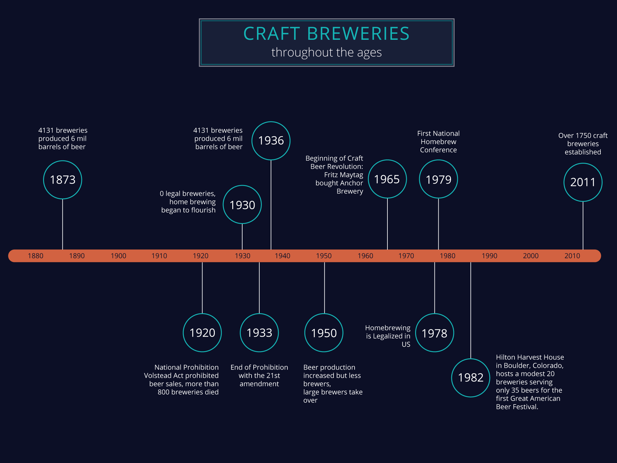
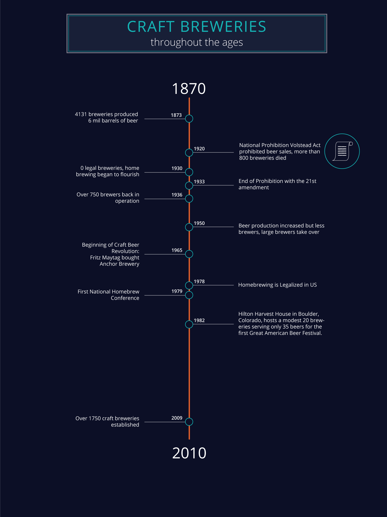
First Iteration
Critique #1
In the horizontal timeline, he found it harder to follow the blurbs for each event since they were not aligned. He did like the vertical timeline more since it had more visual structure and still conveyed the message clearly. An improvement he suggested was to increase the size of the text showing the years in the vertical timeline.
Revisions based on this critique I kept elements from the vertical timeline, specifically the clean visual structure that it has. The text size of the years were increased and highlighted in the revised display.
Critique #2
He liked the vertical timeline more than the horizontal timeline because it had a more uniform criss-cross layout. He noted that the circle along the axis was unable to show precision and noted to perhaps modify it if I wanted to show precise date ’t that obvious as to where they started.
Revisions based on this critique I wanted to keep the precision of the years and decided to have large texts for the years and placed in the bubbles to further highlight them.
Critique #3
She also liked the vertical timeline since it had a more balanced structure compared to the horizontal timeline. She noted that the years in the axis were not very visible. She said she was drawn to the years in the bubbles but found it still visually cluttered and harder to keep track of the message. She suggested to experiment with larger circles in the vertical timeline and perhaps increase the size of the year text too.
Revisions based on this critique I experimented with larger circles in the revised display, specifically having the years in the bubbles to highlight the years. To keep the visual structure and establish a zig-zag sequence, I had the bubbles alternate from left to right.
Second Iteration
Critique #1
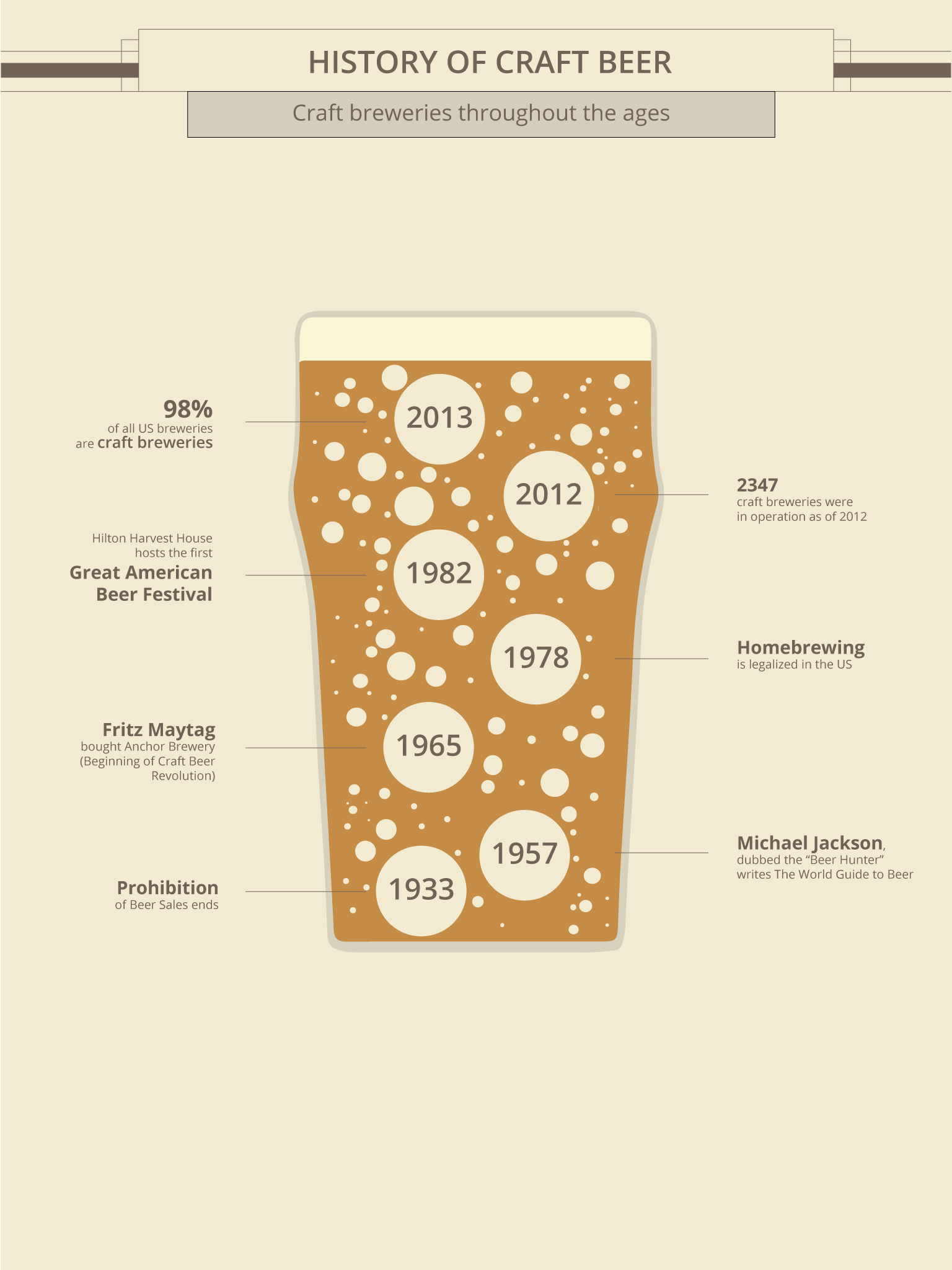
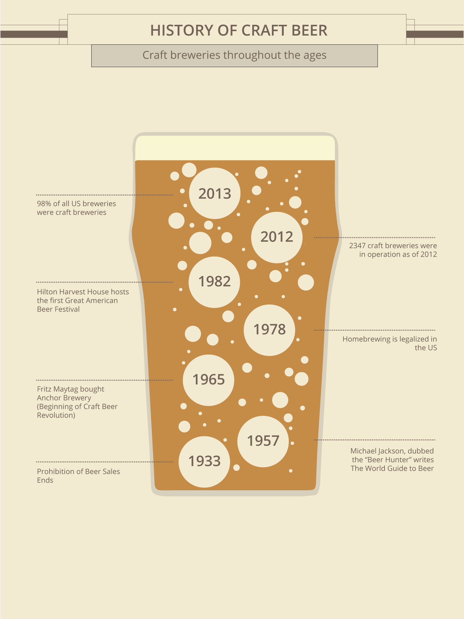
He liked the concept of using bubbles as events in time and having a description for each one of them. He also pointed out that the dotted lines were a slight departure from the models that I chose and suggested using solid or right angled lines. Overall, he thought the timeline display conveyed the idea very clearly.
Revisions based on this critique I've modified the lines to be solid instead of dotted. I also added more bubbles to make the pint glass look more authentic.
Critique #2
She liked the use of the dotted lines to show the details of the events in time and was drawn to the bubbles in the pint glass. She noted that the fonts for the description could be bigger or show emphasis since they look as if they were all the same.
Revisions based on this critique I've increased the font size for each event and added text of different weights to show importance.
Critique #3
He immediately noticed the years and events that happened throughout history by looking at the display. He noted that the contrast between the background and the text could be better since they were quite small and easy to miss when placed in a larger setup.
Revisions based on this critique To increase legibility, I increased the size of the text to better stand out from the background and adjusted the color to have better contrast.
Sources: