Evolution of Beer Types in Washington
I created two relationship displays to portray the various types of beer microbreweries produced in Washington. To simplify the process, I chose only a handful of beers with exceptional reviews. The venn diagram better shows the breweries that produce more than one type of beer while the network diagram better shows the many variety of beers available.
How I emulated my models:
To keep the same color scheme as my color model,
I used the same navy blue as the background, and white (and the occasional orange) for foreground text. To emulate my base model, I used several forms of shading in the venn diagram and in both displays, the title follows the same style used in the base model. For both displays, I utilized the same fonts used in the text model.
-
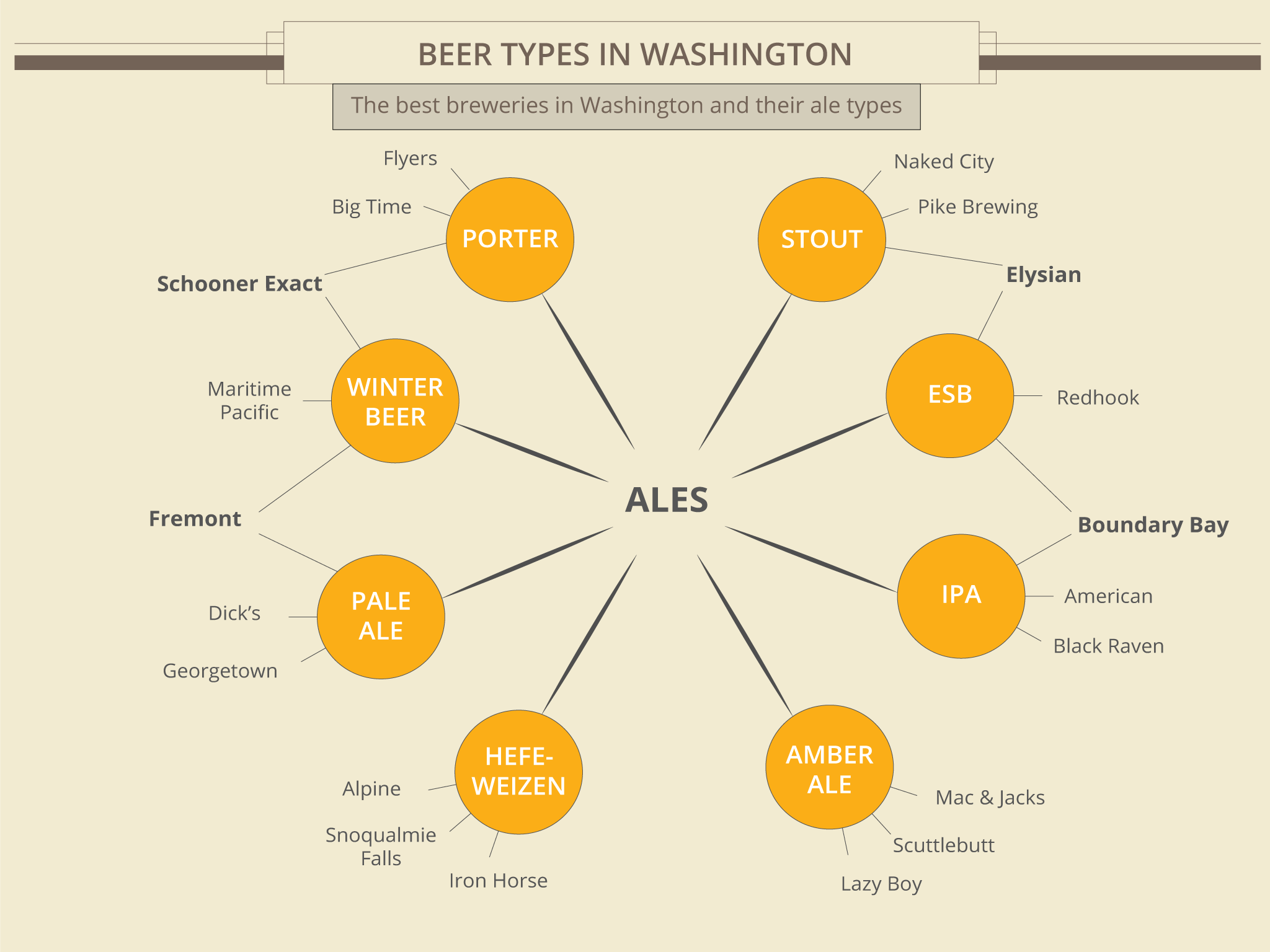 1st Relationships Display
 -
 1st Relationships Display
 -
 1st Relationships Display
 -
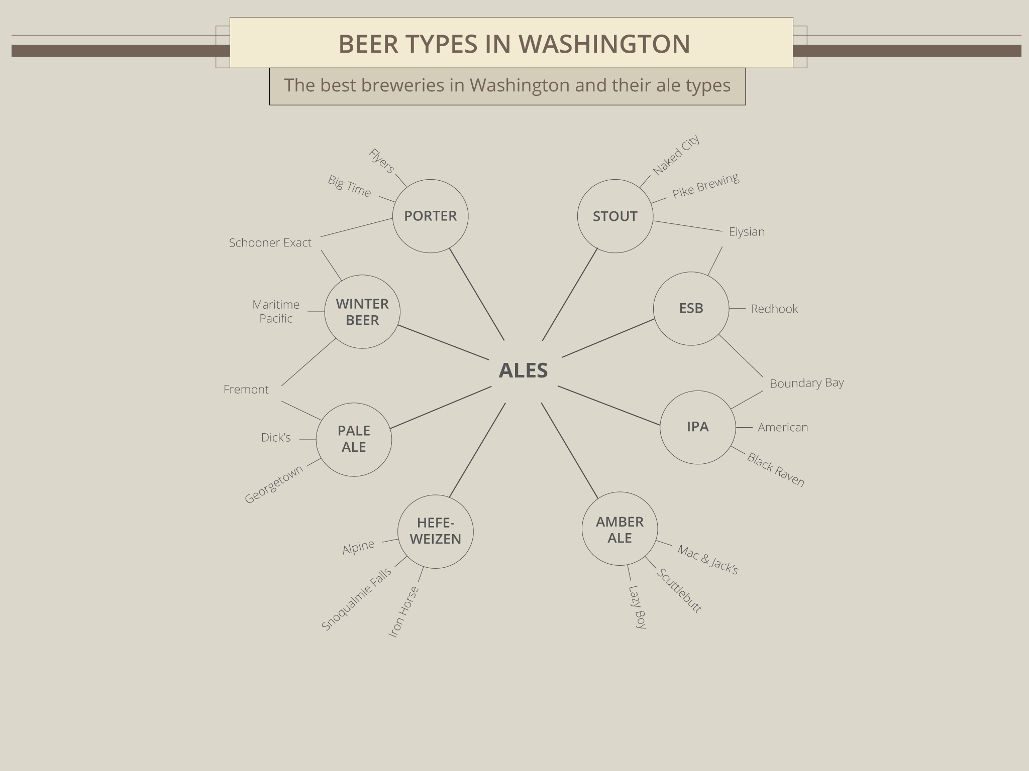
 1st Relationships Display Variant
First Iteration
Critique #1
He liked how the venn diagram display highlighted the different types of breweries and how several breweries made different types of beers. He preferred the network diagram display since it laid out the breweries more clearly and followed a semi-circle shape. He suggested experimenting with font weights to make the breweries that made more beer types stand out more.
Revisions based on this critique I integrated concepts from the clean layout used in the layout display and kept a circle - centric structure in the revised display, keeping the content still highly visible. In the process, I realized I would require more information to populate both the belgians and lagers component and had to exclude them from the revision.
Critique #2
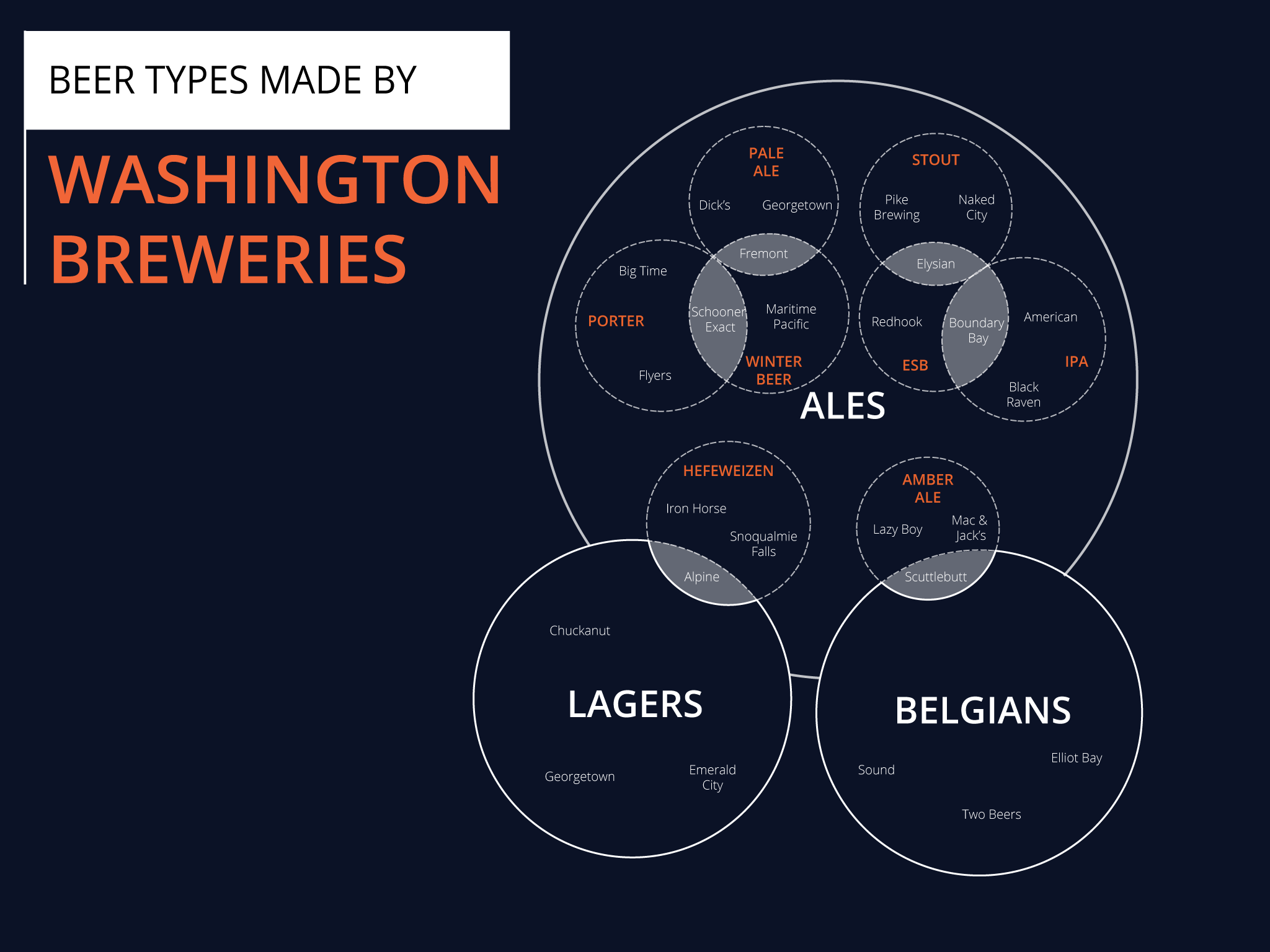
He found that to convey the idea better, the network display performed better since the orange text was easier to spot compared to the venn diagram display. He liked the relationships in the venn diagram display since it had a sense of a ‘mixing’ feel, akin to brewing. However, the lines in the network display was more pleasing. He suggested to develop more visual structure in the venn diagram display to better develop the idea.
Revisions based on this critique I realized there was contrast in the venn diagram and lines were a pleasing aspect found in the network diagram. I completely redid the structure of the revised display to incorporate the circular layout while incorporating lines from the network display into one display, expanding on the visual potential that the venn diagram display had.
Critique #3
He felt that there were too many circles in the venn diagram display and looked a little lopsided. However, he noted that the visual hierarchy in the network display was more pleasing than the venn diagram. However, he liked the potential that the venn diagram display had and suggested to relate the style with the process of making beer. He also suggested experimenting with the concept of bubbles in a pint glass.
Revisions based on this critique I took the concept of bubbles and used circles to represent relations between the craft breweries and their beer types that they produce. Also, I attempted to establish a form of visual heirarchy by having thin relational lines from the center that spread outwards.
Second Iteration
Critique #1
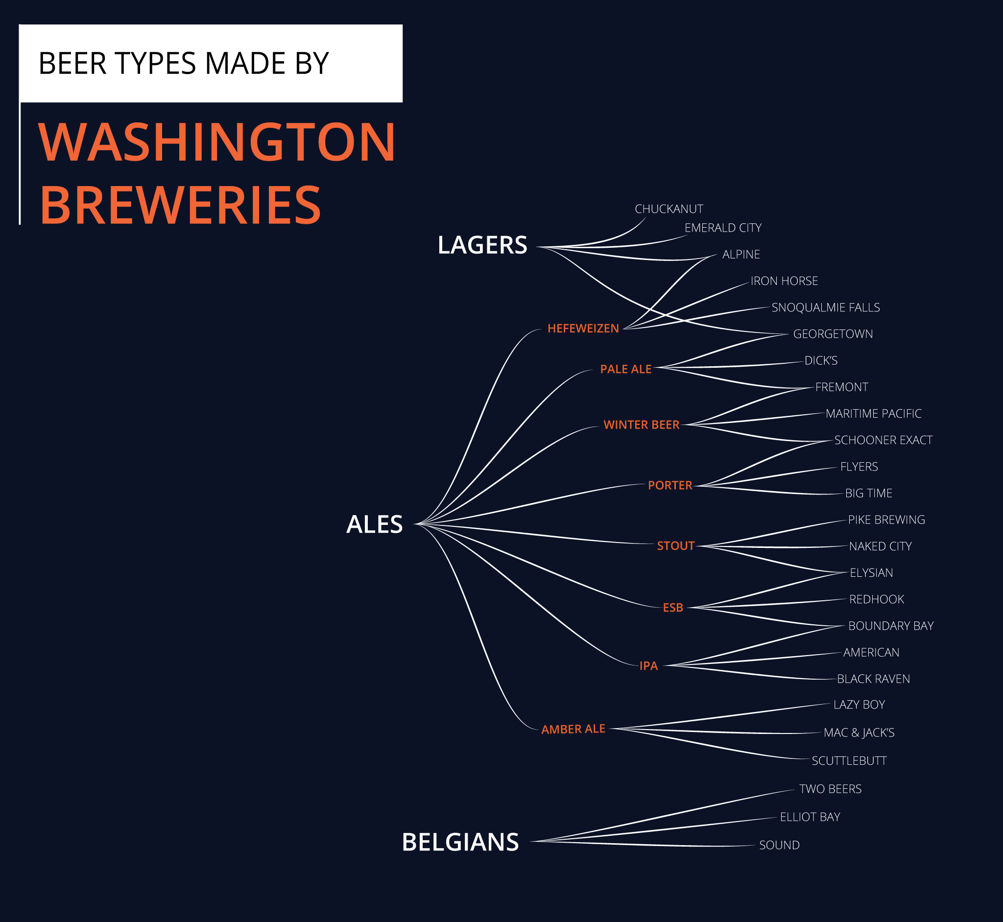
She liked how the display was laid out visually and it had a very clear representation of the relations. She also liked that some breweries specialized in more than one type of beer and liked how I addressed the relation by having the lines point to the same brewery. She suggested to establish a better heirarchy, and perhaps experiment with line thickness or color.
Revisions based on this critique I utilized varying line thickness to establish visual hierarchy when transitioning from Ales to the subtypes of Ales.
Critique #2
He liked the overall distribution of the visual display but found that the venn diagram display still better represented relations between craft breweries, since it was immediately obvious in the older display but not so much in this one. He suggested incorporating more unique concepts used in the venn diagram such as shading and dotted lines to establish better relations.
Revisions based on this critique It was challenging to use elements form the venn diagram display, but I settled for increased font weight for shared breweries amongst categories to achieve the same purpose.
Critique #3
He liked the use of circles to structure the relationship display and thought it emulated the base model well. He noted however that it was less attractive than the previous display since there was more contrast between components. He suggested using color or even overlapping circles for craft breweries.
Revisions based on this critique To increase contrast between elements, I used different stroke weights for the lines and also colored the categories of ales.
Sources: