Evolution of The Rise of Craft Beer
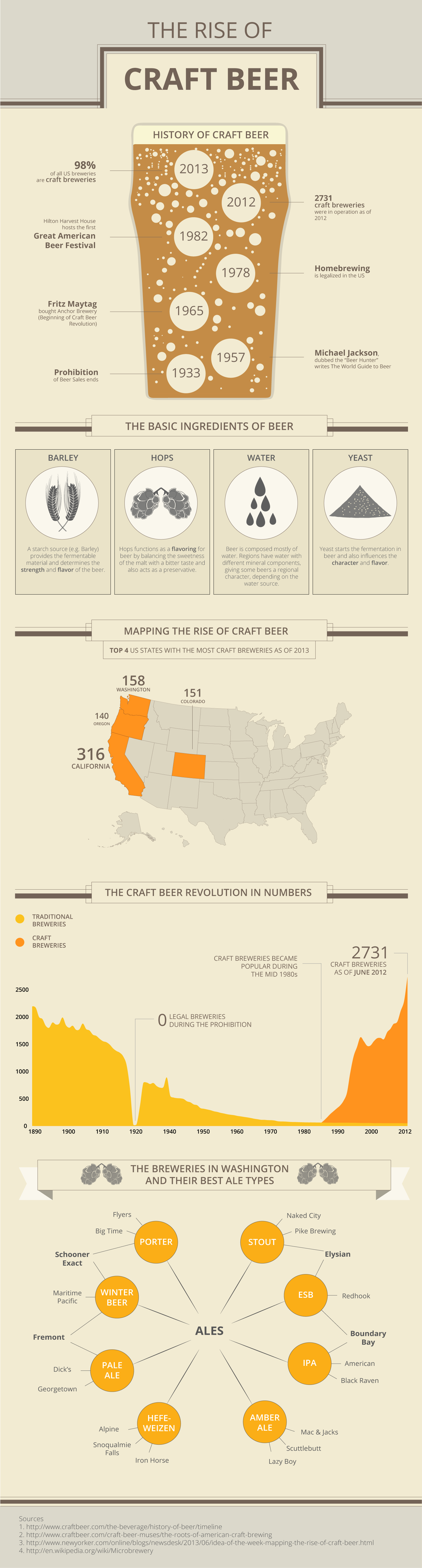
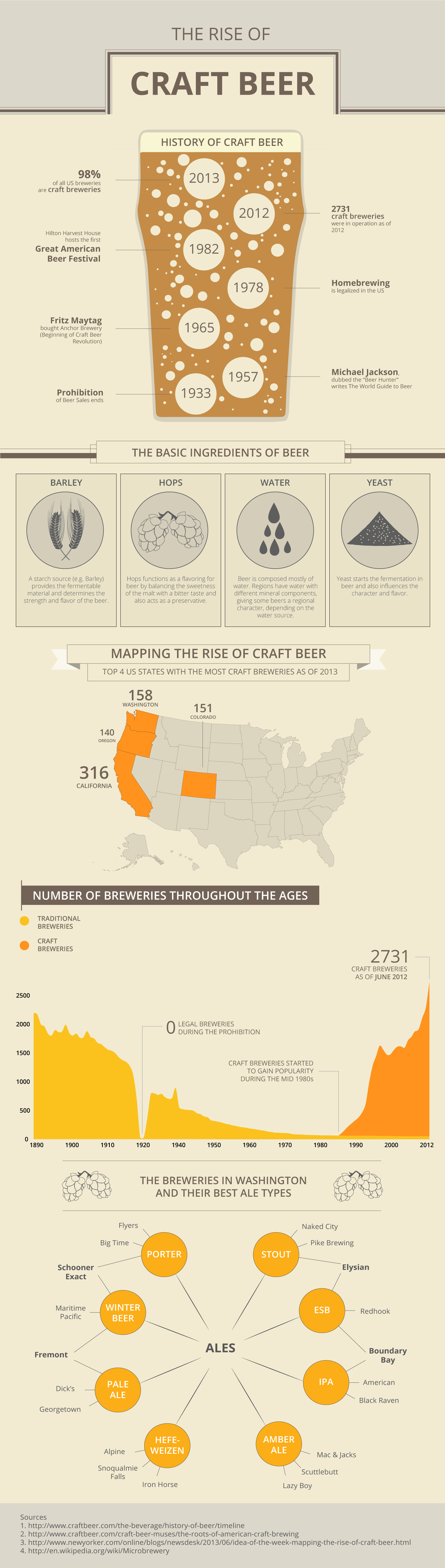
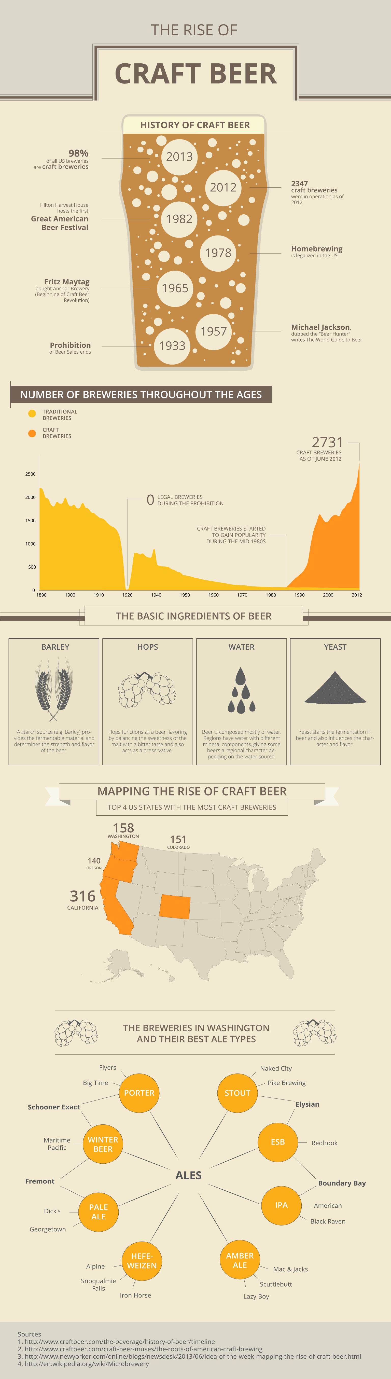
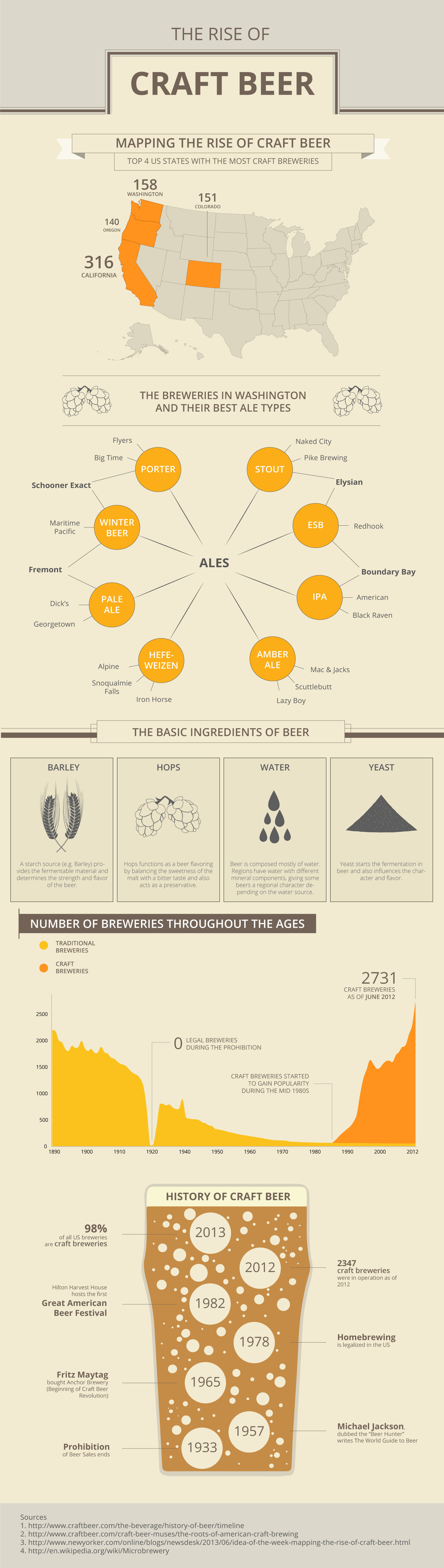
Through this display, I seek to show the rise of craft beer throughout the ages in the U.S. by using a timeline and a map to show how craft beer has changed throughout the ages. To support the idea, I also provided a display of the ingredients of beer and also a breakdown of the various types of ales made by craft breweries in Washington.
How I emulated my models:
To keep the same color scheme as my color model,
I used the same pale tan as the background, and the few bright foreground colors (brown, orange, and yellow). For the titles and text, I used the same fonts in the text model with varying weights to show emphasis. To emulate my base model, I used a lot of thin lines and minimalist icons throughout the display.
-
 1st Layout Display Revised Final
 -
 1st Layout Display Revised
 -
 1st Layout Display
 -
 1st Layout Display
First Iteration
Critique #1
He liked the division of sections in the first layout and thought it conveyed the message very well. He liked both displays but prefered the one with the history of craft beer at the top. He noted that the order would depend on what message I was trying to convey. While both made sense, he thought the one with the history of craft beer had more continuity and to experiment with changing the order of the number of breweries throughout the ages.
Revisions based on this critique I experimented with the order of displays, keeping the timeline display at the top. It was challenging for me to increase the length of the infographic, worrying that it might be too long. However, as a whole I realized the infographic looked pretty balanced.
Critique #2
She liked the linear transition in the first layout since it made most sense. She suggested adding a little more space between the numbers and appearance displays since they looked closer than other componenets. She also suggested adding dividers for sections that have a smaller header since the differing components are percieved similar if they're too close.
Revisions based on this critique I added linear spacing between the displays, making sure each section had enough padding on the top and bottom.
Critique #3
She liked the variation in title styles and liked the version with the timeline display on the top. She thought the arrangement could make more sense if had the appearance, map and numbers swapped since they made more sense to her in that order.
Revisions based on this critique I reordered the displays in the order that she suggested since it made most sense to me too, while keeping the timeline display on the top since it functioned well as a centerpiece.
Second Iteration
Critique #1
She liked the display with the pint glass at the top and thought the spacing was good. She noted that the titles/headers were a little misleading since they were styled differently. She liked the banner titles more and suggested adding more spacing between components and also the size of the main title's font. She suggested increasing the size of the divider on the top to make the title stand out more.
Revisions based on this critique I've added additional spacing between the displays and increased the main title's font since it was a little small. I've also increased the size of the stylistic divider to make the main title more obvious. Also, I've included the same divider before the footer of the infographic to standardize the look.
Critique #2
She liked the arrangement and how the elements were lined up and noted that the appearance display was the only one that lacked a 'pop' of color, compared to the other displays. She suggested adding a little color to the appearance display to balance the infographic out.
Revisions based on this critique I've recolored the circles enclosing the appearance displays to white to make them balance better with the other displays I had.
Critique #3
She liked the overall hierarchy of displays but found that the timeline display looked really attention grabbing. She suggested to make the timeline display more realistic by having all the bubbles float to the top, as a normal beer would.
Revisions based on this critique After attempting to make all the bubble concentrate to the top, the display looked top heavy and didn't look as aesthetically pleasing. Alternatively, I tried to add more bubbles that were concentrated at the top of the pint glass instead, which worked well for me.
Sources: The data/inspiration for this display came from the following sources...