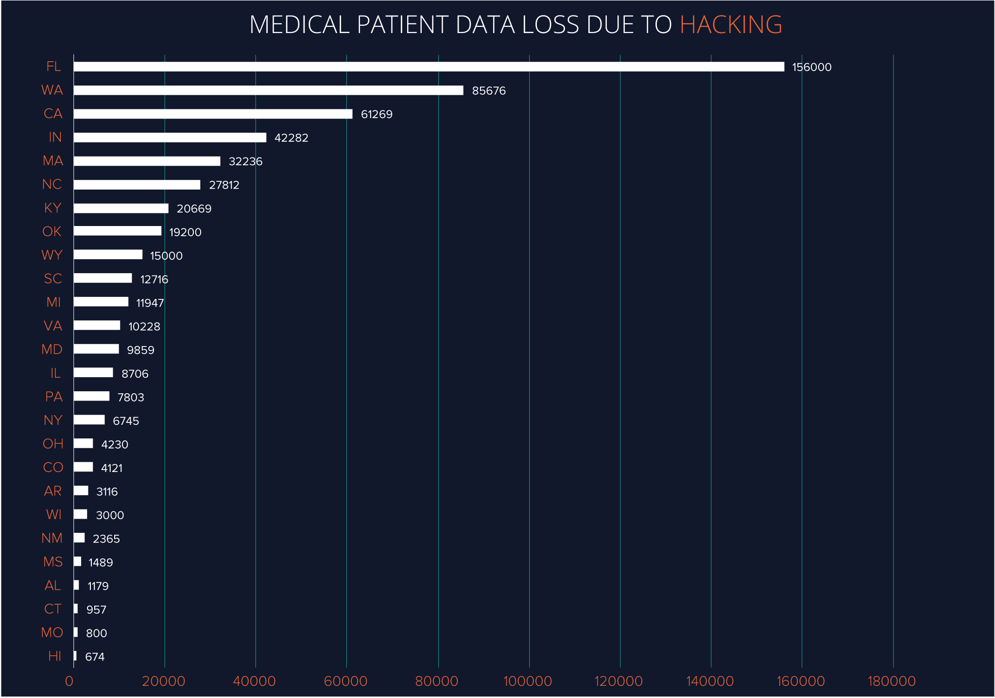
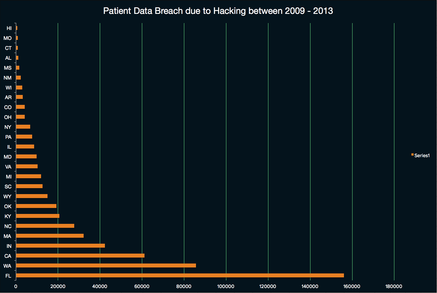
Evolution of Medical Patient Data Breach chart
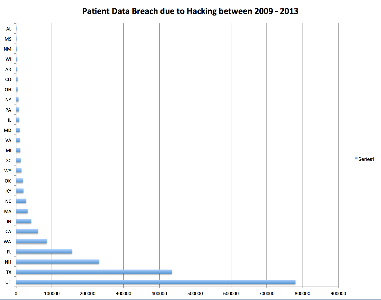
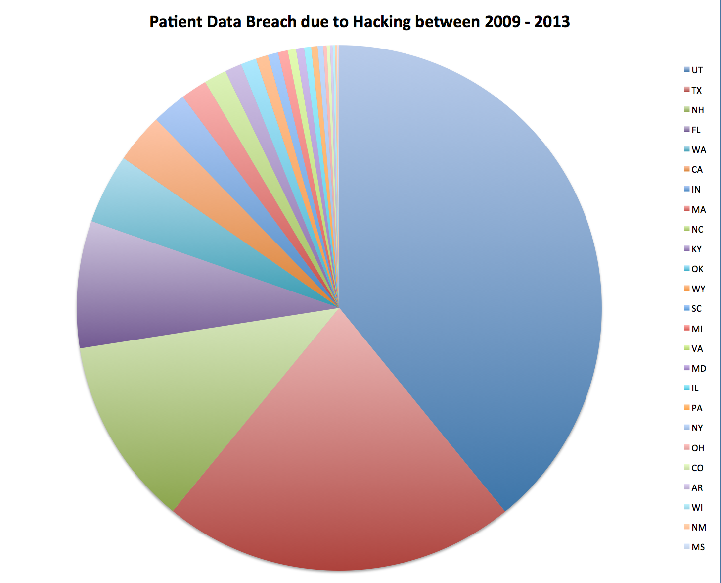
In this display, I’m trying to convey a sense of how many records of patient data is lost due to data breaches as a result of hacking. I first experimented with three different display strategies in Excel (as seen in the slide show below). The number of medical records lost are encoded by the slices in the pie chart in the first display, the vertical bars in the second display and with the horizontal bars in the third display. The second and third display allows me to easily identify the distribution of how much data is lost across the states. While the pie chart indicates which state had the greatest number of patient data lost, the bar charts, especially the horizontal bar chart conveyed the message most effectively that there is one substantial amount of data loss in one of the states. The pie chart has a greater graphical representation of the data, but may be distracting due to the smaller slices.
How I emulated my models:
In Excel, I formatted the horizontal bar chart to emulate my color model. I used the same background and foreground colors, using the bright foreground colors sparingly for the narrow data bars and also the vertical lines. I removed the horizontal axis line to reduce the visual clutter but kept the vertical lines to help viewers distinguish the numbers better. In Illustrator, I changed the fonts used to adopt a more professional look. In the revised model, I emulated the color styles more closely, placing emphasis on some text and the main data values. This was acheived by changing the color of the labels to green.

First Iteration
Critique #1
She noticed that the data sets were represented with a bar chart and also as a pie chart. The larger numbers in the bar chart are located at the bottom. She preferred the bar chart compared to the pie chart since its better for including more details, and suggested to use the top 10 data sets if I were to proceed with the pie chart. It would make more sense if the data were to be arranged in descending format to better emphasize on the loss of patient data.
Revisions based on this critique I attempted at experimenting with a descending data format into the revised edition. It seemed to put emphasis on the highest data values.
Critique #2
She noted that while the pie chart concept was intriguing, too many slices in the pie was not the best approach to conve information, despite being interesting to look at. She felt that the bar chart was the most conducive to convey the information. She also said that it would make more sense to have the larger bars at the bottom, closer to where the scale is. Space wise, she feels that the bar chart would take up more space compared to the pie chart representation.
Revisions based on this critique To place emphasis on the bar chart, I lightened the color of the labels to green, leaving the white data bars to stand out more.
Critique #3
She noted that there was a bar chart and a pie chart that represented the data. Personally, she felt that it was more difficult to find the pie chart’s data since the slices were too small, noting that the bar chart was more effective at visually representing data from least to greatest. She considered representing the data in decreasing order and perhaps increasing the scale to show the smaller values that were hardly visible in the first one. She preferred the bar chart for those reasons, and felt that the contrast between the background and the foreground was effective. She also suggested adding actual numbers to the bars since it was difficult to perform estimations with the data set that I was working on.
Revisions based on this critique I added actual numbers next to the data values in the review to provide accuracy. Viewers won't have to look at the bottom of the bar chart to get the number ranges.
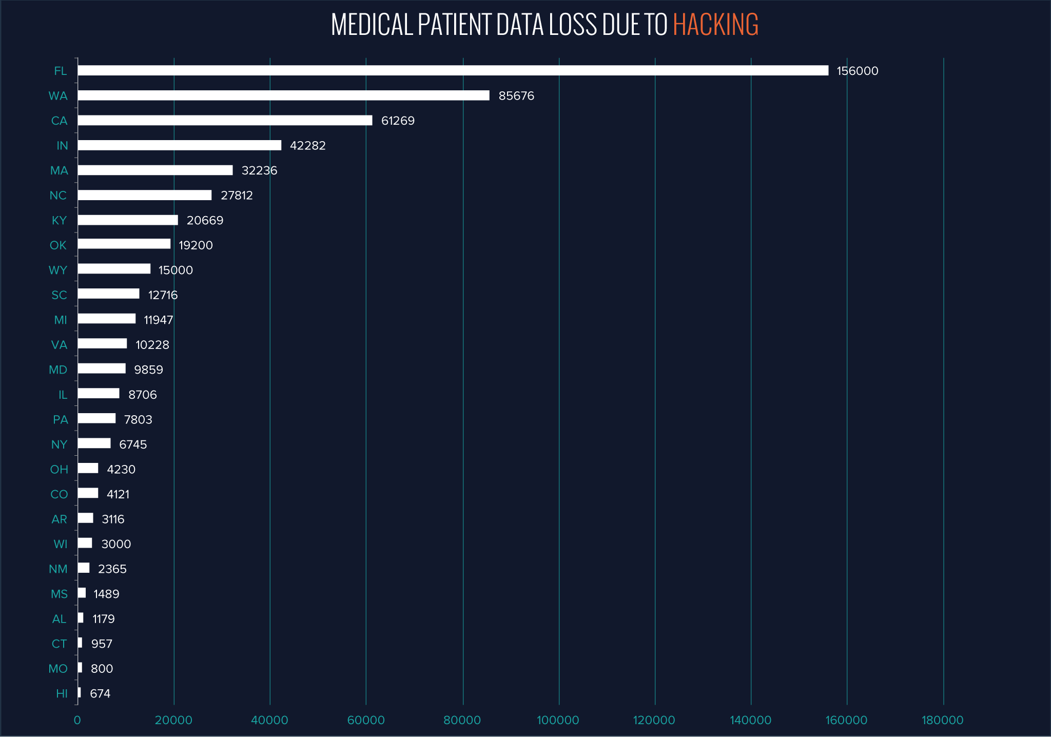
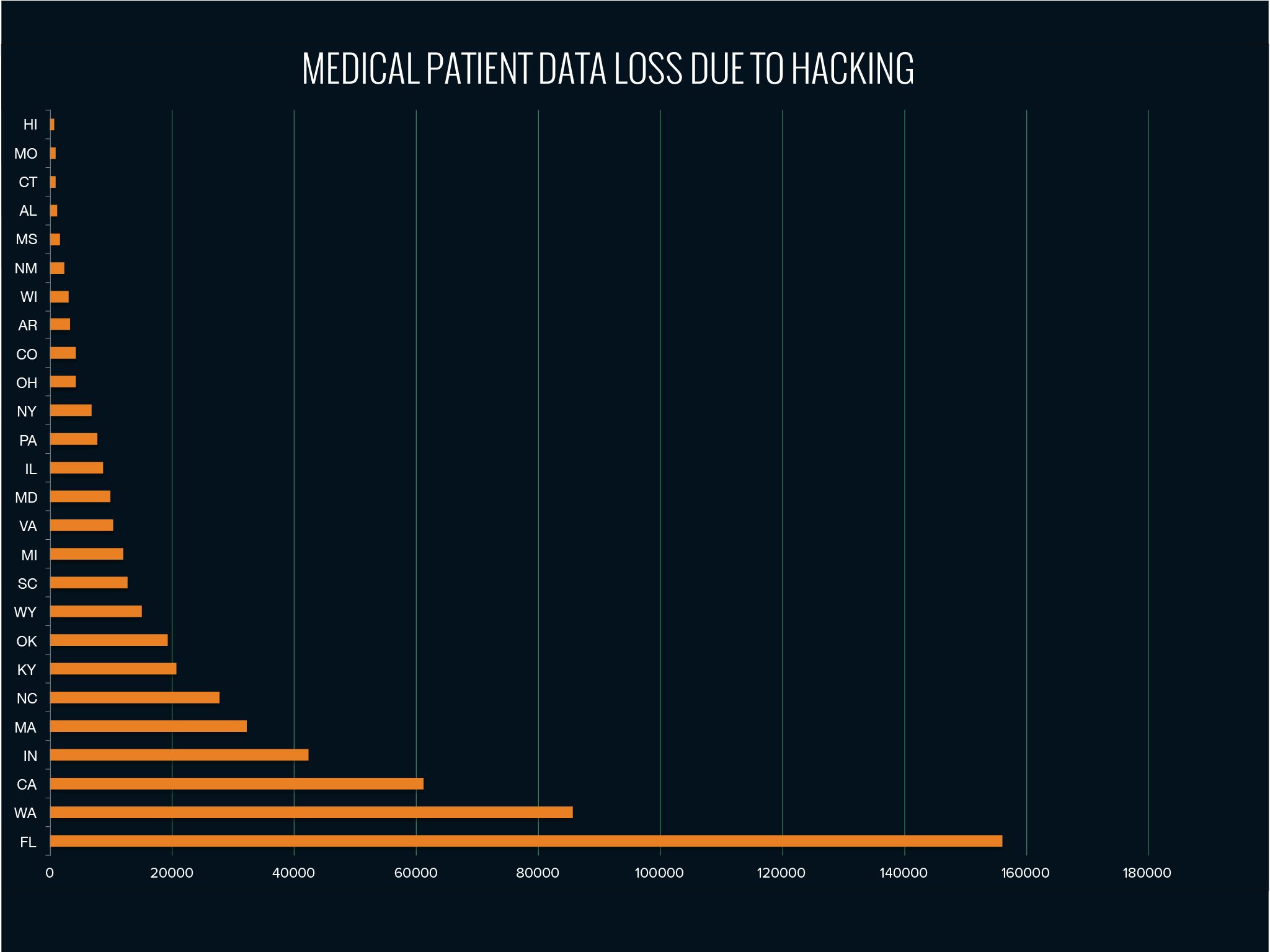
Second Iteration
Critique #1
She liked the addition of numbers to the revised number display since it adds more precision to the data. She also liked the use of a descending data arrangement since it emphasizes on the values. An improvement that she suggested was to reflect the text used in the text model since the fonts were similar to the color model. Additionally, she found the labels not standing out enough from the background, which may cause problems for people with color blindness.
Revisions based on this critique The fonts used for the labels and also the headings have been changed to better relfect the text model.
Critique #2
She liked the contrast of the revised data display, but she also liked the contrast in the previous display too. She was not sure where the graph would be placed in the final infographic, since that would determine which color scheme to adopt. She liked the addition of specific numbers, and that the perception of data would be the same descending or ascending. She felt the labels do not have that much contrast and that the states label should be bigger. The white lines stood out more to her than most of the content.
Revisions based on this critique On top of changing the fonts for the labels, the labels are now colored orange to contrast a little more with the background. In conjunction with the feedback from the first critique, I've also used the proof setup feature in illustrator to ensure that the colors I chose would still be able to show content even to people with color blindness.
Critique #3
He liked the contrast between the foreground and the background in the revised display but found that the fonts used were a little too small since there were too many labels to process. He liked the use of white to show the data bars and had it in decreasing order, placing more emphasis on the larger numbers since they were closer to the top.
Revisions based on this critique The font size used for the labels were also increased to improve legibility. To reduce the cluterred feel that larger fonts have, I formatted the vertical axis to not have 'tick marks' near each label, allowing for a more minimal bar chart.
Sources: The data/inspiration for this display came from the following sources...
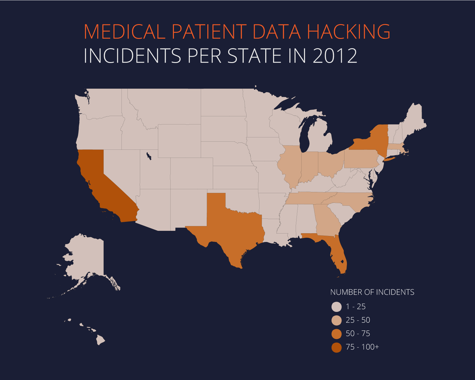
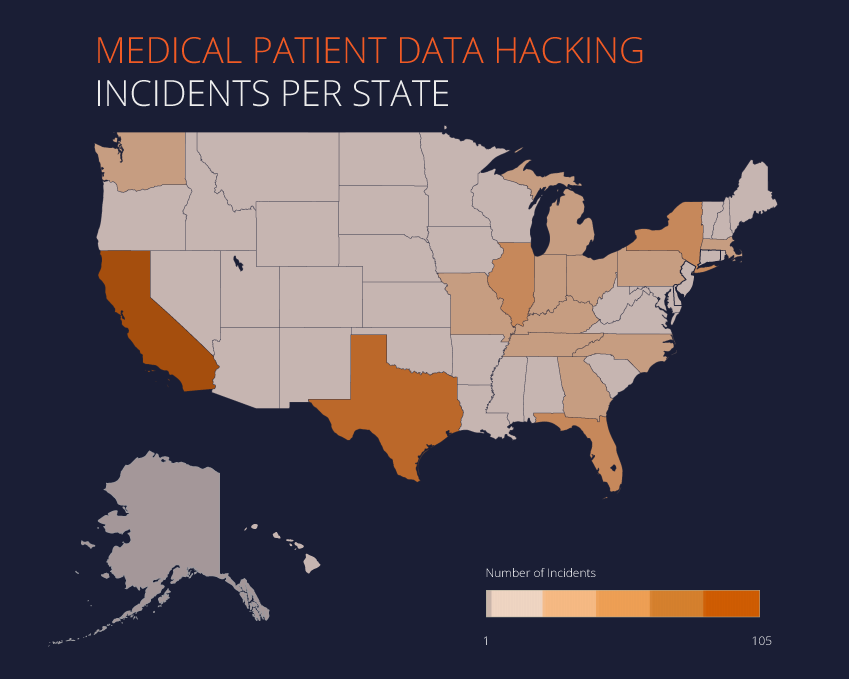
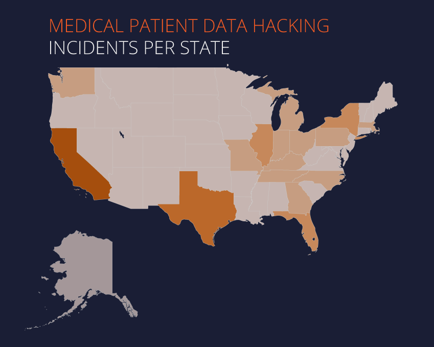
Evolution of Number of Medical Data Loss Incidents due to Hacking Heat Map
In this display, I'm trying to convey a sense of how frequent records of patient data is stolen due to hacking. I figured horizontal bars were not as descriptive in conveying the severity of how much data is stolen across states. As such, I resorted to using a map and varying degrees of color brightness to indicate the data. The map allows me to easily identify which regions are most affected by hacking.
How I emulated my models:
I imported the data into Tableau and used both the number of incidents of medical patient data loss and the states where the incidents occured. Tableau automatically created geographical locations based on the state names. As such, I experimented with displaying the data on a map with the colors indicating the number of incidets. After Tableau created the heat map by state, I imported the display to Illustrator and attempted to emulate the color model and my text model. To emulate the color model, I made the background navy blue and made the maps slightly transparent. I also added the header to emulate the text model more closely.
-
 2nd Revised Again Numbers Display
 -
 2nd Revised Numbers Display
 -
 2nd Numbers Display
First Iteration
Critique #1
It was visible that there was a map with varying brightness and saturation of color to indicate different levels of hacking activity. She assumed that the darker color was the greatest while the lightest was the least. She suggested to have a color scale in the corner to indicate what values the colors represented. She also felt that the description was a little ambiguous and suggested to describe more about the data on the map. The font reflected better in this display compared to the 1st number display.
Revisions based on this critique I've included the measurement scale for the varying degrees of contrast used in the map.
Critique #2
She noticed the shades of color on the map but was not sure what the shades represented. She assumed that the darker colors indicated more incidents. She suggested to have a scale since it was not as obvious as to what the values were. She liked the subtle lines that indicated the state borders and found that this display is capable of showing more information than the other data display.
Revisions based on this critique Together with the measurement scale, I've also included a caption for the measurement scale and enlarged the scale, matching up well with the size of the map.
Critique #3
He immediately noticed it was like a heat map of the most frequent states prone to hacking, but was not too sure of the exact numbers or the time range. He suggested to add labels or bubbles of numbers above each state to indicate the exact amount of hacking activity in each state. He liked the color use but suggested to include more whites or greens to better reflect the color model, perhaps even using an outline of the states instead of a solid color and circles of varying sizes to indicate the numbers.
Revisions based on this critique I've included the date range in the caption to better reflect the data I am using in this display. Additionally, the outlines between states were set to the same color as the background to place more emphasis on the states.
Second Iteration
Critique #1
She noted that the legend was a good addition which helped clarify the different colors used. However, she noticed that there wasn't a middle point value and was unsure of the scale. She suggested to add a value in the middle. She was not too fond of the dark outlines for each state and suggested to use different weights of strokes to make it less obvious. She liked that the legends are located at the bottom of the picture to balance the display.
Revisions based on this critique A middle point value was included to better illustrate the different shades used in the choropleth map. I've also adjusted the stroke weight between states to be less obvious, but retained it to help viewers distinguish the different states.
Critique #2
She liked the colors used in the numbers display, and noted that the original color model had a texture in the background. She suggested to incorporate the texture into the display to better emulate the color model. She noticed the legend had 5 colors and found it providing a good divide between states. However, she also found the middle area harder to distinguish. She suggested perhaps to use less color variation, depending on the distinction I would want to make. She suggested to have the scale more detailed by having 4 quadrants rather than 5.
Revisions based on this critique I reduced the number of gradients used in the legend from 5 to 4 to simplify the division of numbers, and allowing a middle value to be included since it seemed like the feedback I recevied highlighted the need for a middle value. It was challenging to skim down the number of gradients from 5 to 4 since I would be eliminating a middle value. Hence, I had to generalize on the lesser values, and kept the gradients to distinguish the greater values.
Critique #3
He liked the color scheme used since it contrasts with the background well and it was easy to tell the color differences. He also liked the title and found that the text of the legend could be enlarged since it was a little small. Overall, he liked the placement of the elements in the display.
Revisions based on this critique In line with my base model, I altered the legend used, focusing on using bubbles to indicate the different gradients, and increased the size of the legend in order to increase legibility.
Sources: The data/inspiration for this display came from the following sources...