Evolution of Medical Patient Data Breach
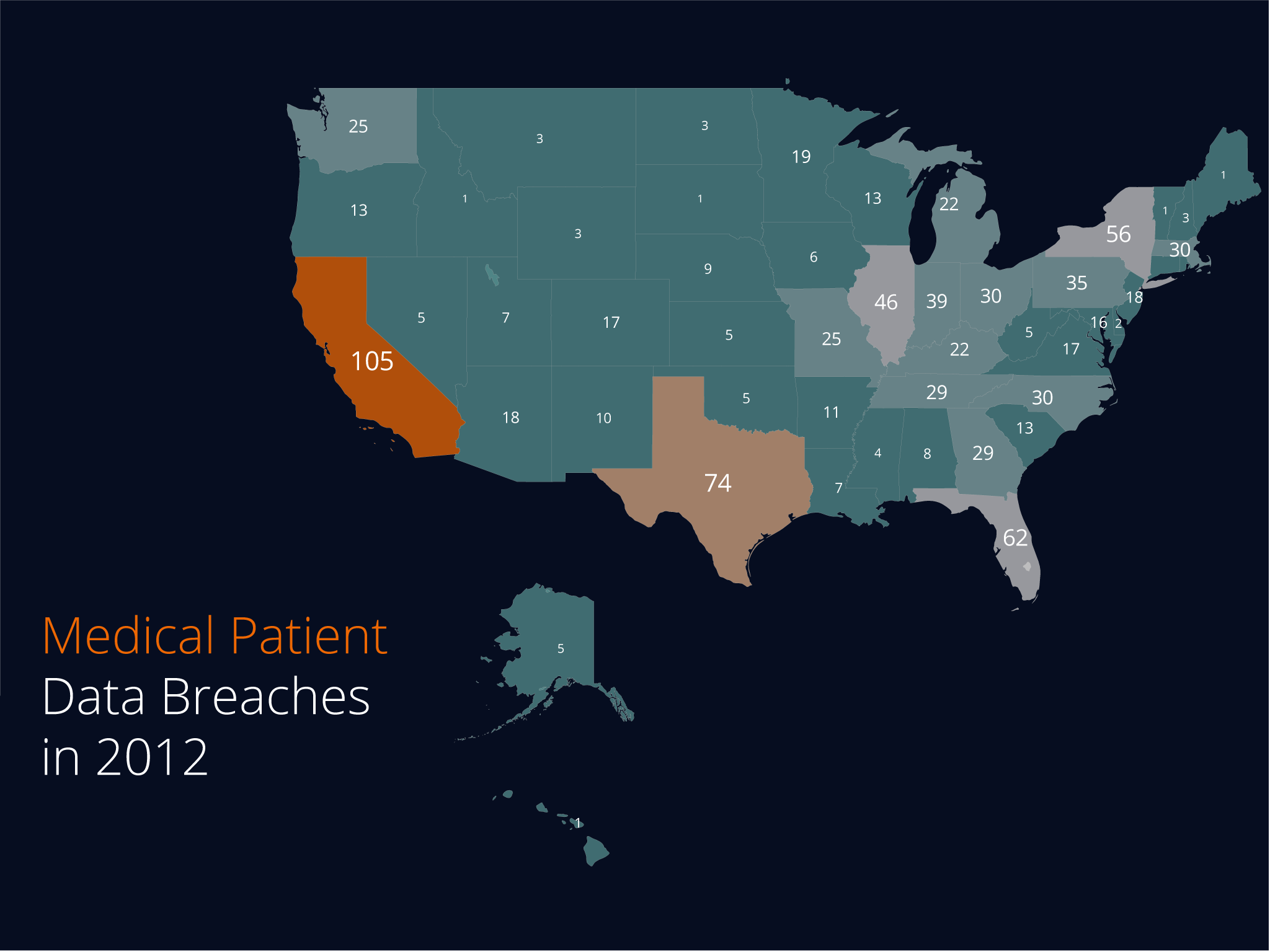
In this display, I'm trying to convey a sense of how frequent records of patient data is stolen due to hacking. The choropleth map allows me to easily identify which regions are most affected by hacking by varying degrees of color saturation. The choropleth map differs from the one I utilized in my numbers display by omitting the legend and having each state having their own individual value. The bubble map utilizes a legend scale but more closely reflected my color model and stylings from the orignial model.
How I emulated my models:
To keep the same color scheme as my color model, I utilized a dark navy blue background for both variations of the location displays, the bubble map having outlines of states that further reflects the color model I used since most elements in the color model were outlines. For both variations, I also used the same primary colors, orange and teal.
-
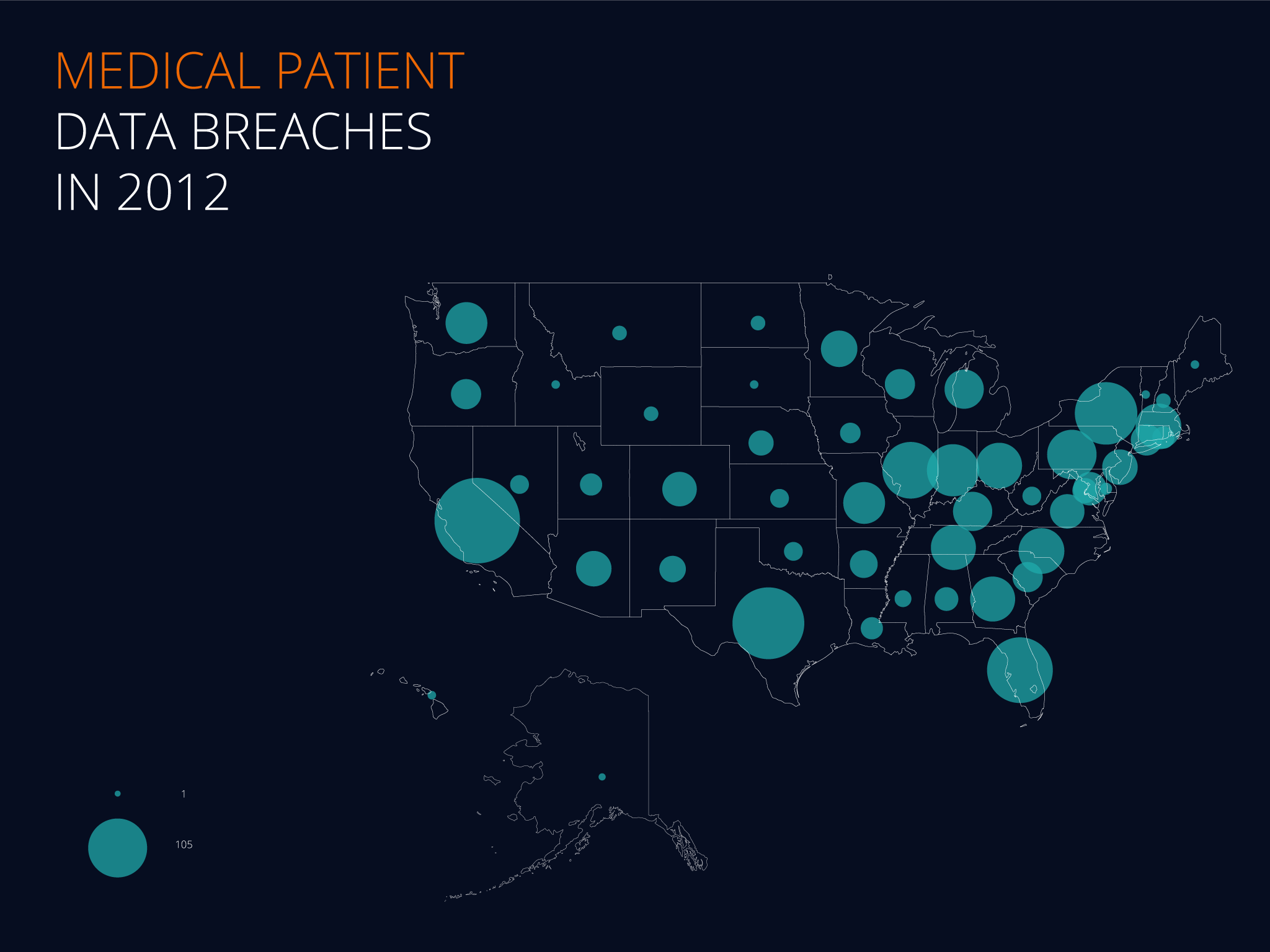
 2nd Revised Location Display
 -
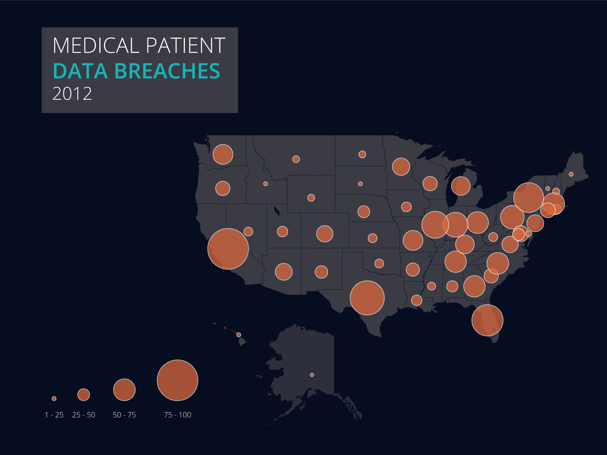 1st Revised Location Display
 -
 1st Location Display Variation
 -
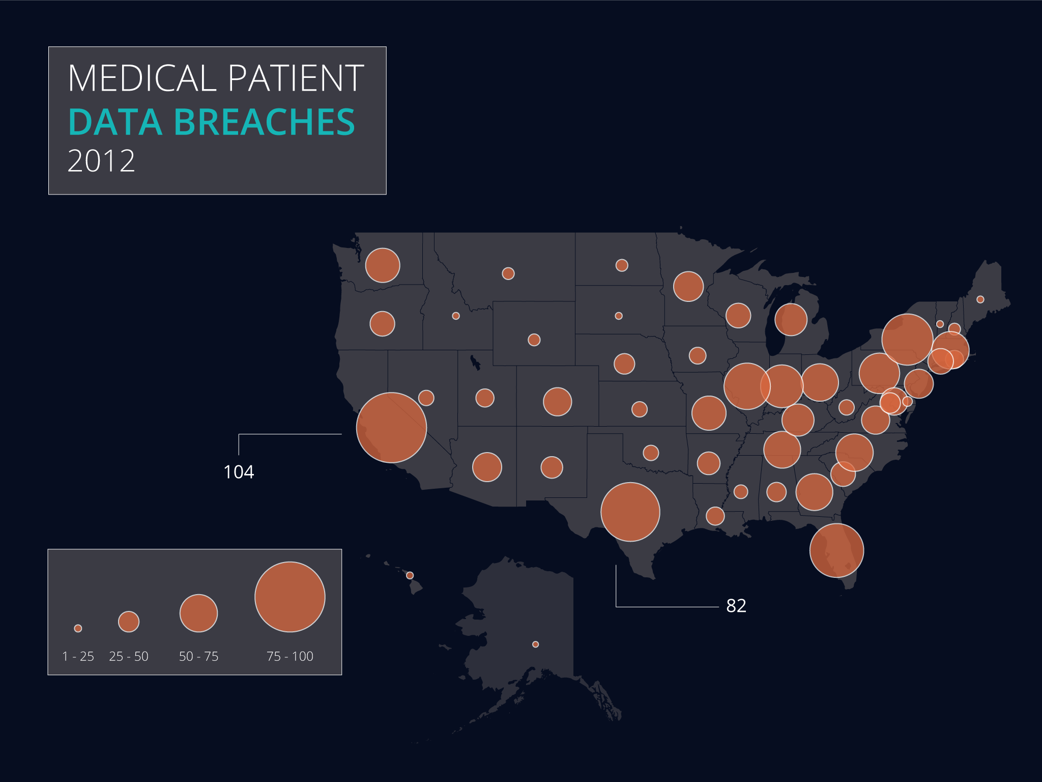
 1st Location Display
First Iteration
Critique #1
She first pointed out the difference in font size used overlaying each state but was not sure if it was done on purpose or to fit within the states. She noticed that the choropleth was more cluttered than the bubble map and was less clean. She pointed out that some of the numbers used in the choropleth were too small, especially the 1. She preferred the second one since the title at the top made more sense and stood out immediately. While the bubbles corresponded to value, the legend was too small and noted that there were no in-between values. She suggested adding more precision or focus on large or small values only.
Revisions based on this critique While altering the bubble map, I decided to add add more emphasis to the legends by increasing their size, and included the ranges of values they would represent. I paid close attention to the number of bubbles I would include, and gave a maximum of 4 bubbles, enough to provide a reference point to viewers, which better reflects focus on the larger and smaller values.
Critique #2
She liked the choropleth map better since it was more obvious to her what was being presented. She noticed that the size of the numbers changed from one place to another depending on the value. She noted that the bubble map had a better visual idea, but the scope was not too detailed since it was harder to see the differences between states, particularly Texas and California. The bubble map emulated the color scheme better and was more clear in terms of the text used.
Revisions based on this critique I attempted to incorporate some of the choropleth map's visual elements and the base model into the bubble map. I did this by adding a fill to the states with a neutral gray background, and using orange to add more contrast to the bubbles.
Critique #3
My first critique pointed out that the bubble map's opaque feel was more appealing and was easier to convey their locations. He found it had a sense of urgency and was more suited to the topic. He also liked the use of varying font size in the choropleth map but found that it was confusing with the lack of legends. My critque also pointed out that the legends in the bubble map were too small and only realized it later.
Revisions based on this critique I modified the legends taking elements that worked well in my other numbers display by including larger legends and their numeric ranges to give better context. Placement was a little challenging as I required more space to include the larger legends. I experimented with having the legends placed to the right of the title but felt that there was a lack of balance in the overall display. I finally settled on a lower left placement, while shifting the adjacent states (Alaska and Hawaii) to the right.
Second Iteration
Critique #1
She liked the use of a solid background instead of an outline of the map. She noticed that the bubbles still looked a little cluttered and only noticed the legend at the bottom after a few seconds. She suggested experimenting with the numbers, perhaps adding them into the circle instead.
Revisions based on this critique I retained the use of a solid background for the map and made the legend more obvious by including a background to highlight the legend.
Critique #2
He liked the use of orange but noted that the white stroke each circle had was more closely related to the color model than to the base model. He found that the legend was helpful but could be positioned better, perhaps at the top or a little higher than where it currently is. He liked how the map is just a little more lighter than the background, giving it a tech feel.
Revisions based on this critique To better reflect the base model, I used a white outline for the text boxes which included the title and the legend, which was still closely related to the base model.
Critique #3
She liked the use of colors and the transparency effect the bubbles had but did not immediately notice the scale. She was a little confused with the ratio since there are bubbles that are in the middle of the scale that have their own size. She suggested to use different gradients in order to differentiate them or make the legends more clear and complete.
Revisions based on this critique To make the scale more noticable, I also moved the position of the legend higher up in the display, on top of the other modifciations I did to address concerns of the other critiques.
Sources: The data/inspiration for this display came from the following sources...