Evolution of Cybersecurity Matters
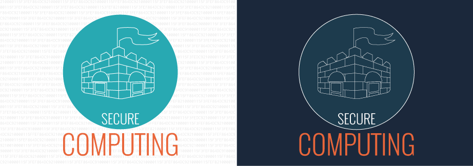
I created a drawing of a fort enclosed in a circle with slightly visible numbers in the background to illustrate the notion of a secured system. The fort represents a secured infrastrucure, surrounded by a circle that represents a secured perimeter. I utilized an opaque background of numbers to represent code, that resided in a company's infrastructure.
In response to the feedback I received, I revised one of the icons. I decided to do away with the white background as it would be difficult to incorporate into the model that I chose. The code in the background was moved into the inner circle and made less obvious in response to my feedback; this was a pleasant challenge for me as I had to figure out how to have text fit in the circle. I also reduced the use of green in the final icon since the focus was in the icons, not the colors.
How I emulated my models:
The color model I used focused on a dark navy blue background contrasted with white and orange foreground colors. I experimented with a white background against greyed out code to emulate a programming interface. In the revised version, I balanced the use of the primary foreground colors (white, green, and orange) as to not distract viewers from the icon. This further emulated the model I chose since it incorporates all the colors used in the model.
-
 1st Appearance Display
 -
 1st Revised Display
First Iteration
Critique #1
My first critic pointed out that the icon represented a fort. The flag reinforced the representation of the icon as a fort. She felt the background of the first variant (with the code background) added to the context of hacking and blended well with the opacity amount. She preferred the first one since it conveyed the message of a secured infrastructure better.
Revisions based on this critique
I kept the code background idea in the final revision, but placed it within the circle to represent a 'secured' system.
Critique #2
While the figure of a fort was immediate, he did not immediately grasp the connection of the icon to security. However, the text and color scheme had a very techy feel to it and helped convey the overall idea. He preferred the more minimalist approach of the second figure since the coding background in the first was a little distracting.
Revisions based on this critique
In line with a more minimalist approach, I used the darker background for my revised icon, while keeping the coding element in it, even though with a smaller amount of text. I reduced the use of green in the revised icon, limiting it to the circle's stroke.
Critique #3
My third critic pointed out immediately the shape of a fort. The background coding text in the first image further reinforced the concept of security. She preferred the first over the second primarily due to the inverted color combination with the coding text in the background. She also felt that the placement for both variants are asymmetrical and well laid out. She suggested that the wordings 'SECURE' should be placed closer in the circle.
Revisions based on this critique
The revised icon had its placement of text revised, with the words 'SECURE' repositioned closer into the circle.
Second Iteration
Critique #1
She immediately noticed the text, castle and flags in the icon. It gives the notion of secure computing and protecting something. She liked the revised version because of the subtle balance of the bright colors against a navy blue background. The code in the background adds to the depth of the icon and the increased stroke size for the fortress helps it stand out more, which adds focus to the castle figure.
Critique #2
She noted that the icon was about secure computing and liked the castle metaphor to indicate a strong structured barrier around the user’s personal information. She preferred the revised edition since the pattern inside the circle helps improve the notion of security. She associates the color scheme to computing, helping the security aspect stand out and liked that the word ‘secure’ is encased inside the circle.
Critique #3
She noticed the castle icon and the faint ‘lines’ in the background, but was not sure if they were numbers. Despite that, she liked the contrast and the combination of two different models into one. She preferred the revised model because of how the colors and text were combined together and had a more subtle background text. She felt that the text ‘secure computing’ should be grouped closer together, or even adopt the same colors to improve legibility.
Sources: The data/inspiration for this display came from the following sources...